 |
 |
|
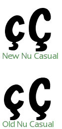
9/18/2016 SundayFinally finished transitioning the store from Kagi (they went out of business) to FastSpring! A few of the fonts are being refurbished, they will be back by 10/18/2016. The nice thing about the new store is that people can just download their fonts after they buy them by clicking on a link at the end of their transaction with FastSpring. Before, they would have to go back to the site and download the "Registered User" version and then enter a password. The new process is much easier. 7/10/2010 SaturdayI finally finished reading the Fontographer manual! It's over 500 pages. A few things I'd like to try have to do with OpenType. I'd like to standardize my fonts with certain features--like automatic ligatures, fractions, etc. I haven't decided exactly which ones, but I'm excited that it will all be doable in Fontographer. Of course, it's not exactly straightforward--you have to create a text file using Adobe's language to define features. However, once that file is set up, as long as the fonts all have the proper characters, you can reuse that file for other fonts. I think I'll experiment with a new font and release it as freeware to test out the features. Of course, feedback will be welcome and appreciated. Look forward to it! 6/27/2010 SundayFontographer has finally been updated to version 5.0! I'm in the process of reading the manual. It's a bit of deja vu, as I'm sure I've read it over a decade ago. However, there are a few new things here and there, so it's worth going through the whole thing again. My plan is to regenerate all the fonts in OpenType format. Then there will just be one format for all the fonts--no more worrying about whether it's TrueType or PostScript, Mac or PC. I'm sure that it will be much less confusing for customers as well. Sometimes too much choice is a bad thing. Anyway, we'll take it one font at a time. I'm going to get Nu Casual ready for re-release. As you can see in previous entries, I was in the middle of a small re-design. Unfortunately, I never released the update due to circumstances. 7/15/2006 SaturdayWorking on the extended character set for Nu Casual to match the design work I've done in the main alphabet. Today, I fixed the cedilla characters.
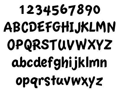
I went to Anime Expo 2006 a couple weeks ago. It was a lot of fun! The highlight was being able to see not only CLAMP in person, but also another of my favorite Manga creators, Koge-Donbo. Koge-Donbo's Pita Ten is one of my favorite manga outside of CLAMP works. I'm currently enjoying her Kamichama Karin series as well. I also got to see the first two episodes of Moon Phase (coming out 8/29/06--just in time for my birthday!) in the English dub. I've been wanting to see this one for a while, since my favorite american voice actor, Monica Rial, is playing the lead. You may have heard Monica on such shows as RaXephon, Full Metal Panic, Kodocha, Burst Angel or Excel Saga. She's a very flexible voice actor, and not just in the kinds of voices she does (most folks can't recognize her voice in Burst Angel), but also on the type of energy she brings to each character. Anyway, Monica is wonderful as Hazuki the cute (tsundere) vampire. 2/19/2006 SundayI saw snow on the mountains for the first time this year! Woo hoo :-) OK, here's an almost finished Nu Casual:
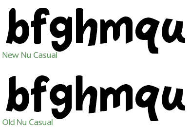
So basically just a bit of spacing and other testing to do and I'll be able to release it. There will be a bit of a change to the formats available. I'm discontinuing plain PostScript and instead I'll be releasing TrueType and OpenType (PostScript flavored). Since the OpenType version is exactly the same for both platforms, that cuts down on a bit of work for me. That's not the only advantage, of course! Basically, plain PostScript is a dead format, and it has been for years. Adobe doesn't even sell plain PostScript fonts anymore. So I'm off to watch the third episode of Pretty Cure Splash Star... Hope you had a good weekend, too :-) 2/18/2006 SaturdayA Table + CSS combination seems to be the the best way to format pages like this blog. The problem is the sidebar. The current workaround in CSS for a colored sidebar is to put a background image the size of the bar you want and have it repeat all the way down. This has problems, too, though. So I decided that on non-navigation only pages (basically every page other than the home page, really!), I will use tables and CSS for positioning and formatting. I'll be sure to keep the tables simple and let CSS do most of the heavy lifting. Currently, I'm using just one 3 x 3 table to format an entire page, so I don't think that's too heinous. I think that when you start putting tables in tables, you have to rethink your approach. I've been working on Nu Casual, too! Probably have something to show on Sunday. 2/12/2006 SundayOn my walk this morning, I had a design revelation: the design of each of the three sizes of Nu Casual needs to be the same. So, specifically, if the 20 pt font has a rounded end, the 14 and 16 pt fonts also need a rounded end, even if the bitmap font for those sizes does not allude to one. I don't know why I didn't design with this in mind from the beginning, as I have applied this approach on Essence. I spent a few hours today fixing the 14 and 16 pt fonts to match this new design philosophy and I am pleased with the results of the blend of the three fonts now:
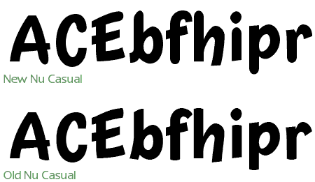
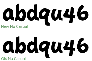
I've also made sure to include overshoot in all of the curved endings, so they will appear to be just as tall as the endings that are not curved. I don't know how relevant this is, however, since the Casual font has a very variable baseline and x-height :-) In other news, the new season of Pretty Cure has started. This time, it is a whole new cast. They have also changed the name of the show to Pretty Cure Splash Star. Two episodes have broadcast so far, and I think that the show gets away from the "fake Dukes of Hazard" syndrome with Mai and Saki being the stand-ins for Nagisa and Honoka. The scenarios are very similar: cute little creatures from another world recruit two girls to be Pretty Cure and fight against powers that would destroy the little creatures world and probably move on to Earth, too, for good measure. However, there are already some differences in the setups of the two shows, for one Mai and Saki seem to be willing to take up the mantle of Pretty Cure right away, whereas Nagisa didn't want to (partly because she thought she could never get along with Honoka). Also, it turns out that Mai and Saki met each other (and the magical creatures) before becoming Pretty Cure years ago. So they have a bit of destiny playing out for them in the new show. The production values for the new show are excellent. There is a greater use of CG (unobtrusively) and the character designs are appealing (Cure Bloom's pineapple hairdo notwithstanding). Basically it looks like they know what worked well in the first show and have expanded on it, rather than reinventing everything. Like Nagisa, Mai is into sports and like Honoka, Saki is the brainy one. It worked as a good contrast before, so there's no reason to change it. 2/4/2006 SaturdayThis week was really busy at work. So today was the first time I was able to work on Nu Casual again. This time, I've added overshoot to the upper and lower case characters and changed the tails to be more consistent. Here's the sample:
I think that I'm going to go back to the old "4"--since it's more "charming." 1/29/2006 SundayWell the first month of the new year is almost over. I feel that I've accomplished a lot, but there's still a lot more to do. I finally finished up the number in Nu Casual 3. However, the blended design needs some further tweaking, so I'll post a sample later. Lately, I've been listening to Horie Mitsuko and the Pretty Cure image albums. An odd combination! Horie is one of those singers that you can immediately identify. She's been around forever (she's been singing professionally longer than I've been alive) and has done a good job maintaining her voice. I was unsurprised to read that she also plays violin. Her expert use of vibrato on long notes belies her other skills :-) Most of her songs from the 70s are in an American 50s style which I like quite a lot (current favorite: Candy Candy). Times were simpler then, or at least the music was. Her latest work can be heard on the ending music duet in the first season of Godannar. Great show, BTW. 1/23/2006 MondayI've done more work on Nu Casual 3. Today I focused on the lower case characters. Mostly I'm finding that the type of design choices are making tend to be making Nu Casual a bit more normal. The original Nu Casual had a few design oddities that were purely a result of the process, rather than aesthetic choices. So I'm taking a less mechanical approach this time.
1/22/2006 SundayWell, well, well. Have you ever tried to do something new and found that it was harder than you thought? And along the way, has someone shaken your confidence--making it even harder to accomplish your goals? Well that's happened to me. But I'm not giving up, no way. I'm going to keep trying until I get it right (Kaleidostar reference, by the way). So anyway, I've been working on Nu Casual lately. I started on a 3.0 version back in 2000, but I got distracted and never finished. The funny thing is that Nu Casual was a design prototype for Essence. I took the three bitmap sizes of Apple's Casual font from the Newton OS and made an outline font for each one. I then merged them together to make one outline font that had all the characteristics of the three bitmap designs. I was very happy with the results from the original Nu Casual, however, I've always thought it could be a bit better. So that's what I'm doing. But instead of just working on the one font that is Nu Casual, I'm going back to the original three outline designs. I figure that I can come up with better ways of approximating the original bitmap design by working directly on that. I use the template layer to store the original bitmap of the size I'm working on. So I need to be able to see the original bitmap and the vector shape at the same time. The problem that I've been having (at least up until today), is that FontLab altered Fontographer's template layer display. Fontographer displayed the template image as pure black, instead of the grey that the older version of Fontographer. This makes working on the vector shape difficult because you can't see what you are doing. Thankfully, version 4.7.2 fixed this problem!
1/18/2006 WednesdayIn the near future, the Scooter Graphics Font Blog will be on Blogger. I've already transferred all the entries (from 1996 to today) to http://scootergraphics.blogspot.com/. The only thing left to do is to develop a template so that my blog has the same look as the rest of the Scooter Graphics web site. I don't imagine that will be too hard. I got the UNDER17 final concert DVD yesterday. Super sweet! Halko has super powers over audiences. It was amazing to see all those glow sticks waving and people jumping in sync to the music. Not just a group of people near the front--the whole place was connected up. I've been listening to Halko's newer material (post-UNDER17, that is) and I can definitely hear a difference. The UNDER17 material was really good, but it was more limited than the songs that Halko is doing as a solo performer/composer. She's broadening her scope these days to many different styles. She's already mastered the dempa music style, so it's on to the next challenge for her. 1/14/2006 SaturdayYou will notice that the home page is a bit larger. I've increased the size of everything by 33%. It was pretty easy to do, once I had the CSS code all set. Just multiply all the pixel dimensions by 1.33333 and you're set :-) I also increased the size of the images. The eWorld style icons were enlarged using two different methods. For some of the icons, I have designed scalable vector versions in Photoshop. So resizing those is trivial. For the rest, I found a method that seems to give good results without looking too fuzzy (a problem when resizing images from small to large). First, I quadrupled the size of the original image with nearest neighbor resampling. Then, I copied the color table to the desktop. After that, I convert from index color to RGB. Next, I resize the image down to the size I want using bilinear resampling. I finish by converting from RGB to index color, using the color table I have on the desktop to make sure the colors stay the same. Pretty easy, but it took a bit of experimenting with different resampling methods to get satisfactory results. 1/13/2006 FridaySo I got up this morning at 2 am to get cat food. However, I had to go to three stores to find one that was open 24 hours a day. Here's a surprise to me: the real world is NOT like the Internet. On the Internet, everything is open 24 hours a day. The real world, not so much. Pixel is happy, though, and that's what matters. Essence is coming along nicely. I'm considering selling a "deluxe" version with all the different point size fonts included. Basically a recap: I'm designing another Espy Sans font called Essence. This time, I'm creating a scalable font based on four different point sizes of the original Espy Sans font. So to do that, I: 1) create a scalable font for each of the 10, 12, 14 and 16 point sizes Espy Sans, 2) use Fontographer's Blend function to create a 11 point font based on the 10 and 12 point fonts, 3) Blend the 14 and 16 point fonts to make a 15 point font, 4) Blend the resulting blended fonts (11 and 15 point) to make a 13 point font. Simple! Each different point size of Espy Sans is a little different in design. So each of my fonts based on those sizes is also different. It seems like a shame to design four fonts and then just release one. In related Essence news, I've decided not to alter the letter spacing from my blended design. I tried that, and what I got was a font that looks OK, but doesn't really look that much like Espy Sans on screen. So the extremely tight letter spacing of Espy Sans will be carried through into the design of Essence. 1/10/2006 TuesdayAfter investigating a way of doing the secondary navigation with a separate unordered list, I've decided to do something even simpler: just a single line of HTML with pipes between the links. This was the look I wanted for the secondary navigation, anyway! (I tend to prefer simpler design. Intricate work is beautiful, but it's not my specialty, so I design what I do best.) The secondary navigation goes into the banner area, so I either have to put the banner as a background image or use a separate DIV for a shortened banner. I'm thinking I'm going with the separate DIV for the banner graphic under the navigation. My primary reason: in CSS-less browsers, putting the banner image in the background will result in no banner at all being displayed. I'm sure, dear reader, you would agree that outcome is non-optimal! 1/9/2006 MondayI think that FLOAT is best avoided if possible. What worked fine in Safari and IE on the Mac did NOT work fine on IE on Windows. I was previously floating the SG corner logo and the putting the banner next to it. Totally unnecessary, now that I think about it. When you have two elements that have known pixel dimensions, using absolute positioning makes much more sense. I keep running into this at work, too: if you have two possible solutions, pick the simplest one. A lot of times, I think I understand something, but I really don't. But that's OK! Part of learning is getting over the fact that you don't know everything you need to know :-) So I've been searching and searching for tutorials on doing second level navigation with CSS tabs. Most of the solutions I have seen require the first level of tabs to be all the same width and in some implementations, changing the font size in the browser badly breaks the tabs. Not good... Too many compromises are being made to do something that should be simple. That should be your first clue that you are barking up the wrong tree. I think the problem is that folks are trying to used nested unordered lists to achieve the two levels. This is a mistake, in my opinion. It would make sense to do that if access to second level navigation was necessary on every page. But that's hardly ever the case. Second level navigations is only of any good to users if it is attached to the first level navigation that it goes with! Using nested unordered lists in this manner produces a site map on every page in browsers that don't support CSS. Loading the user up with information that they don't currently need is no favor to them! So my two-level navigation solution is simple: instead of using nested unordered lists, I'll use two sets of unordered lists. The main tabs will be on the first set and the second level navigation will be on the second set. This means that the main tabs can stay the same for each page, while the second level navigation will have to be re-written for each main level. That's not so bad, really. And it keeps a lot of unnecessary code out of individual pages. I can't believe I've wasted a whole day looking for a no-good solution when there was a simple, correct, one waiting for me at 9 pm! P.S. I still don't know how/when to use FLOATs :-) 1/7/2006 SaturdayThe home page is now formatted entirely with CSS. I got the "Reaching Out" to float in the correct position this morning. It is just a nested list! Simple solutions are the best. I'm starting to think that an enlargement of 150% from the original design might be a little too big. I was basing my change on the improvement in screen resolution since the site was launched. The difference between 72 ppi and 96 ppi is 1-1/3x, so that would mean just 133.3%. Fortunately, pencils have erasers and graphics can be resized down. I'm looking forward to adding tabs to all the pages. Maybe I'll work on that tonight after I get back from riding my Vespa. Ciao! 1/6/2006 FridayI've been having fun trying to recreate old screens from eWorld in CSS and HTML. Since most computers don't have the old eWorld fonts on them, the recreations don't look exactly the same, but they are pretty close. The original eWorld screenshot:
My HTLM/CSS version :-) I'm having trouble getting the "Reaching Out" to float, so I left that off on my first attempt. Perhaps a different approach will get the same effect. I'm thinking that maybe if I make that a second level unordered list, it might work. 1/3/2006 TuesdayI think I've found something that will solve my font problem. It's an automated system of replacing text with a graphic called PHP + CSS Dynamic Text Replacement. Yeah! In other news, I went to the Post Office this morning to pick up my package from Japan. I ordered two Halko (Haruko Momoi) items. One was a CD+DVD of Majokko Tsukune-Chan. It's a 15 minute show (just one short episode on the DVD) about a magical girl who seems to be a bit of a troublemaker. I've watched it and wish I could tell you more about it, but my Japanese is very limited :-(. Another problem is that there is almost zero information about the series in English. (Just watch, this blog entry will become #1 in Google.) In the very first part of the episode, she "rescues" a stranded, starving hiker by magically barbecuing her mascot character for him. He appears as a ghost in the remainder of the episode. So Halko provides the voice for the main character as well as singing and composing the opening and ending songs (the full versions are on the accompanying CD). The songs are very different from her previous work, at least in terms of instrumentation. I may be wrong, but I don't think I heard a synthesizer of drum machine on either one! The opening song starts with violin (played "fiddle" style), xylophone, banjo and drums. A flute, glockenspiel and spoons can be heard later in the song. Halko sings in her "cute" voice, of course. The other Halko item was Wonder Momo-i. This has two songs that NAMCO uses in the game "Taiko no tatsujin." Folks that are familiar with Halko's sound are bound to be surprised by the title song. Wonder Momo-i starts out electronic and then quickly moves into horns, guitar, Hammond organ and drums played in a Mighty Mighty Bosstones style. Halko sings in her "cute voice" mode. Suddenly, a hard rock guitar starts up and the vocals take a more aggressive tone--the first time I heard it, I was sure there was another vocalist on the track. Someone really good, too. Nope, still Halko! She has an amazingly flexible voice. (A similar surprise is waiting for fans of Monica Rial when they hear her performance as Jo in Burst Angel.) She also sings her own baking vocals on this track. I've noticed this before, she has developed a "method" to these. She uses a different voice for each baking part. So if the main vocal is say: cute and a little sexy, the baking vocal will be VERY cute and innocent. Quirky, but very, very good! L-O-V-E! Do your best! Momoi! 1/2/2006 MondayHappy New Year! I'm getting a lot closer to having a table-less layout using CSS. I'm finding that of all the technical tricks I'm learning, the most important trick is to stay organized. I've actually sketched out the different parts of the site on a piece of paper and refer to this as I'm working with nested DIVs. It's really helpful. What isn't helpful is font embedding. I'm trying to achieve a certain "look" based on the eWorld user interface. So I need to use a bold narrow font for some of the text. Unfortunately, Impact is a bit too bold and not narrow enough. Arial Narrow is OK, but doesn't really duplicate the look. If I could just embed the font I want to use, I wouldn't have to go through this compromise! But current embedding technologies for web browsers are pretty bad and not well supported. So maybe I'll use images for the text I want. I know that sounds very non-CSS-y, but as a designer, it's what is necessary. Hopefully the future will provide a better solution. In the meantime, I'll just make sure that the alt tags of the images are correct. THAT is a compromise I can live with :-) 12/30/2005 FridayGot up this morning at 5 am and continued. It turns out that I had misunderstood how padding works. I was previously using layer positioning to put the tabs where they should go. However, this approach doesn't work when you want to cover something that is to the left with white (the blue bar is a repeating image, 1 px tall by 91 wide). So I knew I had to put the layer at the very left and top of the page. But when I did this, the tabs lined up against the SG logo, not the colored banner. So if I can't move the layer, what do I do? I guessed that the solution was in moving the content inside the layer. All it took was a simple padding-left: 91px and my blue bar problem was solved. The lesson here is that if you are trying to do something simple, the implementation should also be simple. Stop and re-think if it is not, chances are, you've missed something basic. In other news, I am eagerly awaiting Momoi Haruko's WONDER MOMO.i CD from CDJapan. I also ordered Majokko Tsukune-chan volume 1 + CD--an OVA series I know almost nothing about. Momoi plays Tsukune-chan as well as performing the OP and ED music. That's good enough for me! Momoi is probably best known for her role as Nurse Witch Komugi. She was also the singer/songwriter in the duo UNDER17. Her voice is unbelievably cute :-) 12/29/2005 ThursdayAlmost have the design in CSS down... As you can see, the side bar is giving me a little trouble. I'd continue working on it, but if I stare at this screen any longer, my eyes will fall out. 12/28/2005 WednesdayI take it all back. CSS-based formatting is the way to go. I've spent the day struggling to understand how to make tabs with text instead of images using CSS. Basically, I've put together two techniques I learned from two different web sites to just get the simple effect I was trying for. Now that I've spent all this time, I fell like I'm fully committed to making CSS-based formatting the default for this web site. The benefits are pretty amazing, even if you don't utilize all the features CSS can provide--separate style sheets for print vs. on screen, more accessible web design by reducing the reliance on images for navigation, layers, etc. So I'm going to spend the time to do it right. It's the language of the modern web. I've also decided from a practical and design perspective, different colors for each section of the web site is no good. So we'll be going with what I call "Scooter Blue" or #3366CC AKA #36C. You know, THIS COLOR . Please look forward to it! 12/27/2005 TuesdaySo I have been working on the navigation bar at the top of this page (soon to be at the top of every page). I added a mouseover in Adobe ImageReady, but I'm not sure it's absolutely necessary. It's neat but maybe a bit gimmicky. I took a look at the HTML for the mouseover and was pretty surprised to see how long it was! Back in the old days of the Internet, that kind of superfluous nonsense wouldn't be tolerated. Why, eight years ago if you put that on your page, you would have people boycotting your site outside your house with picket signs and everything (my memory on this may not be exact...) So back to reality. I'd like to have this on every page and if I need to make changes, I'd like it to change automatically (or at least magically) in GoLive. I'm sure there is some way to do that using stationary or something. 12/23/2005 FridayAggh! I know that it is a poor workman who blames his tools, but Cubase is starting to drive me nuts! My Tascam firewire audio interface doesn't fully control Cubase even though it's in Mackie emulation mode... Why? Who knows... Maybe I need to upgrade. Why can't stuff just work? Should I spend the money to upgrade from SL 2 to SX 3 or should I jump the boat entirely? I think that once I get all my hardware/software stuff on my music mac sorted out, everything should just work all the time. I just need to do some more research to get everything to work properly. Next year, that is! Merry Christmas, y'all! :-) 12/22/2005 ThursdayHad a good day at work today! My co-worker improved a design I had started while I was on vacation and did a terrific job of it, too. I was happy to see my original--hastily put together--design for a brochure basically still there but noticeably improved. He also created other material related to the brochure in the same style. One of the things I liked that he did was to have an optical illusion for the headlines like this:
The effect on the printout was more extreme, but the idea is that the lower parts of the letters look darker than the top parts. Since this design will be one we will update each month (it's for a new event each time, so the layout stays the same but all the content changes), I was worried when I saw this! I thought that I would have to create the two-tone letter effect each time in Illustrator :-) But it's actually just a trick of the eye. So it's easy to do and looks really neat. I'm sure the client will be impressed, too. So I've been thinking about changing how I do font distribution at Scooter Graphics. I'm thinking that perhaps it would be better to e-mail the registered versions of fonts to people rather than making them download it from the web site. Font files are pretty tiny, especially so with OpenType, so I think that this might be easier for folks. They also wouldn't have to worry about password-protected zip files (some people have a little trouble with those in Windows), since the font will just be there as a file in the e-mail. However, this will mean that either Kagi or I will have to do the e-mailing. I'm thinking that Kagi won't do fulfillment without charging me extra--and I'd like to avoid that. Another idea might be adopting PayPal as a payment option. That has some interesting possibilities, too! In the end, I would rather adopt a solution that makes things simpler for customers than one that confuses them. 12/21/2005 WednesdaySo this is the new "look." (Note: The buttons and tabs are not currently functional--I'll get them working this weekend.) I was thinking of doing this using CSS and PNG graphics, but then thought, "Huh? Am I trying to design to please some web standards board or am I just trying to get something done that will work well in most browsers?" So it's back to tables! I am using table background color for the vertical and horizontal color bars. Maybe this won't work in older browsers, but at least they will see something. If I used CSS, they wouldn't see anything close to the intended design. I think when designing for the Web, you just got to go with what works and what you know :-) Anyway, the new layout uses a new wrinkle that I thought up to avoid nested tables, so I guess I'm improving the implementation as well. So I've been watching a new series called Karin. It's about a family of vampires who live in Japan. The oldest sister, Karin, is a bit of an oddity, though. Instead of sucking blood out of humans, she does the opposite! Her body produces more blood than she needs, so when she bites someone, she is actually giving them a transfusion of vampire blood! (Of course, since vampire blood is incompatible with human blood, there's no problem--or whatever...) Of course, if she can't find a "victim" in time she has an embarrassingly huge nose bleed (hey, it has to come out somewhere, right?). Did I mention that this is a romantic comedy? :-) The manga will be coming out next year from TokyoPop--retitled "Chibi Vampire." Perhaps the anime will be licensed here, too... 12/20/2005 TuesdayI'm so glad I took time off work! I haven't taken more than a day here and a day there in over a year and a half. I didn't realize how burned out I was. So I have had a lot of success lately with my music and web site design. I'm at least a couple years behind the times on Cubase (my main music program) and Adobe GoLive (I used to use Page Mill). You know the part I hated most about college? Reading textbooks. That's what reading software manuals feels like, too. However, good news! They don't make software manuals anymore, so you just have to "learn by doing." I'm not sure if this is an improvement, but at least I don't fall asleep 200 pages in anymore. :-) So on Monday's update, I put up an idea for the new home page for Scooter Graphics. I've tweaked it a little since then. I still like the tabs at the top, but I didn't like how the blue line goes all the way across underneath the tabs. It made the "SG" logo look unbalanced. So I changed that and also designed a few different section pages. Yeah! This is going to be much easier for folks to get around in. The old navigation system kinda just grew as the site expanded, so it wasn't planned like I'm doing now. Here's a peek at what I've done today:
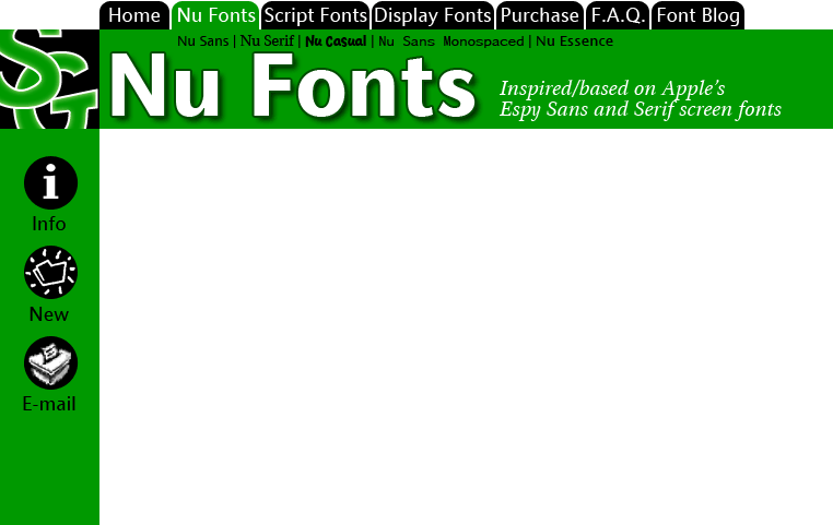
It's so GREEN! I like it :-) What do you think about the subsection titles? Go ahead and e-mail me if you think this is/is not a good way to get to the different fonts in the section. Note that this is the main section page--I'll have a quick overview of each font with a link to download each one just on this page. The subsection pages will just be for folks who want to know more before downloading. Here are the rest of the section pages I did today, just three more to design...
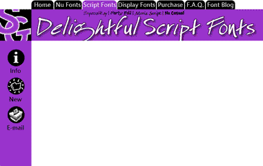
Obviously not actual size! What do you think about the word "Delightful?" It's one of my pet words these days. And it just happens to have a "g" in it which is very cool since Especial Kay has an awesome "g" in it.
So I've pretty much got all my fonts right there in these three screens. I have more designs than these, but I think I'd like to showcase my best work and let some of the older fonts go--at least until I can get time to improve them. In other news, I just got Starship Operators today from Right Stuf. I'll be watching that tonight! KOTOKO does the opening and ending themes for the show. She's just awesome. I saw her concert and panel at Anime Expo '05. She actually brought a band with her! Most J-Pop artists that come over here just perform to a tape, but she put on a full show--she even had costume changes. Very professional. I can't wait for her CDs to be available here in the states. The English dub was done by The Ocean Group. They do most of Gundam, so space battle shows are no stranger to them! I recognize a few familiar voices. Nicole Bouma (last heard as the adorable Tanpopo in Dokkoida?!) and Kirby Morrow (Trowa Barton from Gundam Wing and Miroku in Inu Yasha) put in some good work. (And, yes. I'm trying to update the font blog every weekday from now on :-) 12/19/2005 MondayOne of the things that Don't Make Me Think talks about is the kinds of things to put on the home page of a web site. So I'm not just working to create new graphics and such, but also make it easier for first time visitors to see what Scooter Graphics is all about. So here's what I've come up with Site ID: Scooter Graphics Welcome Blurb: Welcome to Scooter Graphics. Marty has been designing fonts since 1994. You can download and try these typefaces exclusively from this web site. Some fonts on this web site are free and some are reasonably-priced shareware. Tabs: Home Nu Fonts (Nu Sans, Nu Serif, Nu Casual, Nu Sans Mono), Script (Moris Script, Especial Kay, Marty Bold), Display (Electrode, Receipt, Scooterboy, etc.), Purchase, F.A.Q., Font Blog I don't really think that Scooter Graphics needs a search function, but maybe I'm wrong. I'll be sure to ask a few folks and if it's handy, I'll put it in. Since most folks aren't limited to 640x480 monitors these days, I'm going to increase the size of the graphics by 150%. Another thing I'm thinking about is putting the most recent entry from the font blog on the home page, with a link to the rest. Blogs are pretty popular these days, aren't they? Here's my first try in Photoshop:
So anyway... In episode 37 of Pretty Cure, in one scene the bad guys brushing their teeth. Who knew? I guess folks from the Dusk Zone are not only interested in obtaining the power of the Prism Stones, but also maintaining proper oral hygiene. Of course, in the very next episode, Nagisa (Cure Black) is brushing her teeth during the previous episode recap. Good thing, too. You don't want kids getting the wrong idea about taking care of their teeth. It's not just something that bad guys do! 12/16/2005 FridayI've decided to update Scooter Graphics. This is going to be on two fronts: this site and the fonts. I'll be updating the site first. I've just finished reading Steve Krug's excellent Don't Make Me Think: A Common Sense Approach to Web Usability (2nd edition) and I'm going to put what I learned about usability into Scooter Graphics. It's going to be great! I'm also going to be using Adobe GoLive to update the site from now on. That will make things much easier for me to update. In the past, I've been editing the HTML by hand when I've had to, since Adobe Page Mill doesn't work in Mac OS X (and has been discontinued by Adobe). It's fun learning new things. :-) So I think that the eWorld layout will change so that I can have persistent navigation on all the web pages. I have to find a way to do that and still be true to my roots. Wish me luck! The other part of the upgrade will be the long overdue conversion to OpenType. Basically, OpenType makes things a lot simpler for users of fonts, while adding a lot of flexibility. They also work on Mac and Windows, so you don't have to have two different versions of the same font if you work on both platforms. Any moderately recent version of Windows or Macintosh has OpenType support built in. I will still keep the PostScript and TrueType versions for folks who are "retro-computing." I don't want to keep anyone from using my fonts. However, since I'll be concentrating on OpenType from here on, PostScript and TrueType versions of my fonts won't be updated regularly. This isn't so bad, though, since all my ideas for updates have to do with OpenType-specific features. As they say on Science Ninja Team: Gatchaman, "Look forward to it!" 9/21/2003 Sunday
1/21/2003 TuesdayActually, that should have read, "next Tuesday" :-). Anyway, the Nu Sans Monospaced family is done with the addition of the bold italic. The Nu Font pack has also been updated. 1/10/2003 FridayI'm working on updating the site and getting ready for my latest release. With the addition of bold italic, I've finally finished off the Nu Sans Monospaced family. I will release the Nu Font Pack as well as the individual family this Tuesday. 1/2/2001 TuesdayHappy new year! Today I began some "cleaning up" of Nu Sans that has been needed for a while. Basically, a few bitmap characters (still used for on screen display in PostScript) were bothering me. I'm also going through and making sure that the accented characters look the same as the non-accented characters (as far as the base glyph is concerned, at least!). This was only a problem in some of the italic characters. Also, it looks like I'll have to re-design the 24 pt. bitmaps for the italic. They aren't very good. All in all, it's not stuff that deserves a full version number upgrade, but it will be a nice update for some folks. While I was taking a look at Nu Sans today, I pondered the idea of somehow merging Nu Sans with Essence to achieve better printout. But then I decided that the focus for Essence should be on-screen, while Nu Sans is for printing. I think that people have been waiting for a "true" Espy-clone that they can use as an anti-aliased font on screen. So I'm going to just stick to that idea and see where it leads me. I'm also considering making Essence TrueType only. I know that there are a few PostScript holdouts who will be mad about this, but I think that the TrueType format gives me the most flexibility for an on-screen font, without having to rely on bitmaps to do the job (and I'm still cleaning up the job on Nu Sans--nearly a year after the last release!). Also, I think that I may be losing customers who don't know and don't care about the difference between PostScript and TrueType. They don't want to worry about formats, they just want to use the font. Having one choice might make it easier on folks to decide to download and install the font. 12/30/2000 SaturdayInto the wee hours of the morning, I finished off the alphabet characters (and a few punctuation marks) for my newest font: Essence. I've got a pretty good description of what I'm trying to accomplish in the last log entry, so I won't repeat myself. But I thought that a screen shoot might be a good thing to show at this first "milestone" for Essence...
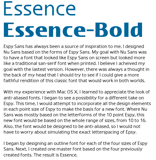
If it looks like Epsy (or Espy, whatever, it's early in the morning, you can't expect me to spel!), that's intentional. I printed out a bunch of text to compare Essence to my Nu Sans. Essence wins hands down as being the most "Espy"ish. It looks good on paper, but my main goal is to have Essence be a great screen font first--it should look good under any circumstances: aliased, anti-aliased, grid fitted, whatever. I'll explain later... 12/4/2000 MondayJust watched the first part of the new "Dune" on Sci-Fi. It looks pretty good, but I'd like to see the David Lynch version after so that I can compare. I saw it as a kid and didn't understand it too well. Perhaps now that I am older and wiser it will make more sense :-) Along the same lines as the new Nu Casual, I am creating a new font. This new font is based on Espy Sans, but it goes a different direction than my Nu Sans. Where Nu Sans is a printer-friendly Espy Sans, the new font will try to more closely match the design of the original bitmaps. I have found that basing a font on simply one bitmap size as a model is not optimal. The process will take quite a bit more time, as each finished font is the average of four fonts. I design an outline to fit the 10, 12, 14 and 16 bitmap fonts of Espy Sans. I know that I have a good outline by performing a simple check: I generate a bitmap font double the size of the font I'm working on. If that looks good, I'm set. After the outlines for the four fonts are good, I combine them into one font (actually a three step process: 10 + 12, 14 + 16 and then combining the results of those two). I was toying with a name for this new font. When I had to change the name of Epsy Sans, I polled my users and they all voted on Nu Sans. This got Apple off my back. It was a week later when I got an e-mail from one of my users congratulating me on the new name, saying that I was able to thumb my nose at Apple after all. You see, "Nu Sans" is pronounced the same as the English word "nuisance." Indeed, I was a nuisance to Apple :-) So I thought about basing the name of the font on this chance semblance of syllables. I wanted to keep something of Espy Sans (what inspired the new font) while still respecting the legacy of my work on Nu Sans. So I started thinking about "E" as in Espy. E Sans? No, that won't do--too obvious. Apple would burst a blood vessel. But there is a word that sounds something like it: "Essence." I like the implications of the name. It is the literally the essence of Espy Sans. I am taking the individual characteristics of each bitmap size and merging them into one font. It really works for me. I should have some pictures up soon. 8/13/2000 SundayI went over the handlebars of my bicycle on Tuesday, so I've not been able to do much work on the computer lately. However, I'm starting to feel better. I was able to work sporadically on an update to Nu Casual. I'm creating outlines for each of the three bitmap sizes of the Newton handwriting font and then merging them together. Previously, I just based Nu Casual on the 20 pt. So far, I'm very pleased with the results. Here's the new uppercase:
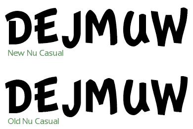
7/12/2000 WednesdayOK, here's John Steed:
And, back to sleep, again...
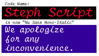
7/11/2000 TuesdayI'm working on an update to Nu Serif that brings two new fonts into the family: SemiBold and SemiBold Italic. I've also discovered a few discrepancies in the design of Nu Serif (even after the 4.0 "harmonization" release a few weeks ago). Just a few minor things, like the regular version of a letter would have one or two more control points than the bold version. There were also a few major things that I changed. I removed the serifs from the italic "r"s and created a new "y" for the bold italic, so that it would look more like the italic "y". The "y" I had before was completely different! This release will also be the start of a new policy at Scooter Graphics: when a font is released, the font pack will also be released on the same day. This might put back the release by a few days, but I think that in the long run it will be much less confusing for everyone. I'm not going to worry about waiting for info-mac to get my new release, but I will start uploading to them so that users in other countries can have an easier time downloading my software. 6/28/2000 WednesdayI'm making a bunch of changes to the web site. My goal is to bring everything up to date with my new font designing software (FontLab) and to update the documentation on some of my older fonts so that it is more professional. I'm also working on a quickie update to Nu Serif that will add Nu Serif-Semi bold and Semi bold Italic to the family. All of this should be final by the first week of next month. I'm also going to experiment with updating the fonts simultaneously with the font packs. Hopefully, this will mean that more people will opt for the font pack (which is a better deal for them and me). I'm going to go back to using Info-Mac as my backup FTP sites for my individual font packages, so this should offset any bandwidth issues. I'm very grateful for all the nice things people have been saying about my new Nu Sans Mono-Italic (shown below). It's good to know that my work is appreciated :-) 5/9/2000 TuesdayOkay, so it wound up being Tuesday... Oh well. I found a small glitch in the Windows version and decided to put off the release a day so I could fix the problem. Flint was having trouble with the TrueType instructions in the Nu Sans Mono-Italic font. So I opened up FontLab and made the necessary repairs. No big deal. Anyway, I am working on some rather minor changes to the font family to be incorporated with the release this Tuesday of the Nu Font Pack as well as Nu Sans Mono 2.1. I'll have a demonstration here of the changes tomorrow. 5/5/2000 FridayWait till Monday... 4/11/2000 TuesdayReleased Nu Sans 9.4. Marty's Design Log Archive: |
||
